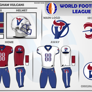

LOGOS: For the shades of blue in the new logo, I took the blue from the original and made part of the blue areas 10% lighter, and the rest 10% darker in comparison. The big change was enlarging the V-torch element in the logo so that it breaks out of the circle. The flames were modified a bit, and extended down into the V to add a shading element to the football shape made by the V's negative space. The new secondary logo is inspired by the spear held by the statue the team derived its name from, with flames coming off each side as it flies.
HELMET: This helmet is heavily inspired by the original team's helmets, using the same 3-stripe pattern, shell and facemask colors. The logo is larger than the original version and depicts the updated primary logo.
UNIFORMS: Both uniforms use the same pants design, with the spear from the secondary logo overlaying an angular white panel meant together to invoke a smoke trail behind the fiery spear. The primary logo adorns the sides of the sleeves, and the darker blue is used on the collar, sleeves and pant legs.