
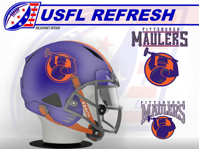
My take on this logo is pretty true to the original, but I added some gray 'highlights' to the logo on the man and hammer to bring that color into the logo itself, and rotated the logo down so the man is leaning into his swing a bit. The helmet is largely in line with the original, but I added a couple gray accent marks to the lower jaw area.


