
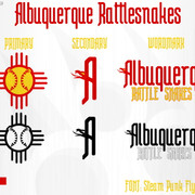
First revision of my concept for a Pro Soccer team identity in Milwaukee, WI. Changed the roundel interior to a homage to the People's flag design popular in the city, with the soccer ball on the top half and making the bottom half lines out of bricks in reference to the cream bricks that "Cream City" comes from. I also made some alterations to the secondary logo to make it flow a little more and try to make the numbers (414) stand out a bit better.
3 views

Cream City FC Branding Sheet Mk.2

Added to Team (Re)brands4 years ago

First revision of my concept for a Pro Soccer team identity in Milwaukee, WI. Changed the roundel interior to a homage to the People's flag design popular in the city, with the soccer ball on the top half and making the bottom half lines out of bricks in reference to the cream bricks that "Cream City" comes from. I also made some alterations to the secondary logo to make it flow a little more and try to make the numbers (414) stand out a bit better.

  • Resolution Unit inches
  • Software paint.net 4.3.10
  • X Resolution 96/1 dpi
  • Y Resolution 96/1 dpi